

I’m always in awe of artists who can master pencils the way Marco Mazzoni does. I don’t know much about this artist but I was really affected by this piece when I scrolled down Google Reader and found it posted on Phantasmaphile.

This is a page from the world’s most mysterious document, the “Voynich manuscript“. It’s a completely hand written and illustrated book that has remained largely undecyphered to this day. The illustrations point to it being a book about medicine and herbal remedies but the subject matter seems to cover quite a lot of ground including astronomy.

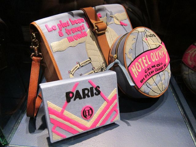
Olympia Le-Tan is a French artist who hand stitches these wonderful handbags and minaudières. I am shamefully monolingual so I had to look up the definition of a minaudière:
min·au·dière
n. pl. min·au·dières A small ornamental case for a woman’s cosmetics, jewelry, or personal items that is often carried as a handbag.
Please don’t ask me to pronounce this with my broad Australian accent! At any rate, Olympia makes gorgeous things. I particularly love the colour scheme of these bags but Susie Bubble shot a bunch of photos of Olympia’s other wonderful pieces and you should take a look!

Before we got our trusty old colour wheel a bunch of hardworking colour scientists sweated bullets trying to figure out the best way to document colour systems. I am very partial to this infographic (1769 style!) by Jacob Christian Schäffer, yes the fancy frames do have my vote! You can read more about the fascinating history of colour charting and documentation on Imprint.

One of the things I like about flying is seemingly defying the laws of gravity and not crashing. I also like looking down upon farmland and seeing a patchwork of colours laid underneath me. So I think these rugs by Florian Pucher are particularly clever because I can enjoy the aerial views from a height of 175cm and only have to worry about tripping over the corner. You can buy these in colour schemes inspired by Europe, Africa, Netherlands and USA but since the wool is from New Zealand wouldn’t it be fitting if there was an New Zealand or Australian design?
That voynich manuscript is so fucking fascinating.. I am ridiculously impressed.
Thanks for sahring all those fascinating and beautiful things!
I believe it would be “min-ord-ee-air”, gg high school French.
Those little bags are super cute, and the pencil drawing is simply stunning.