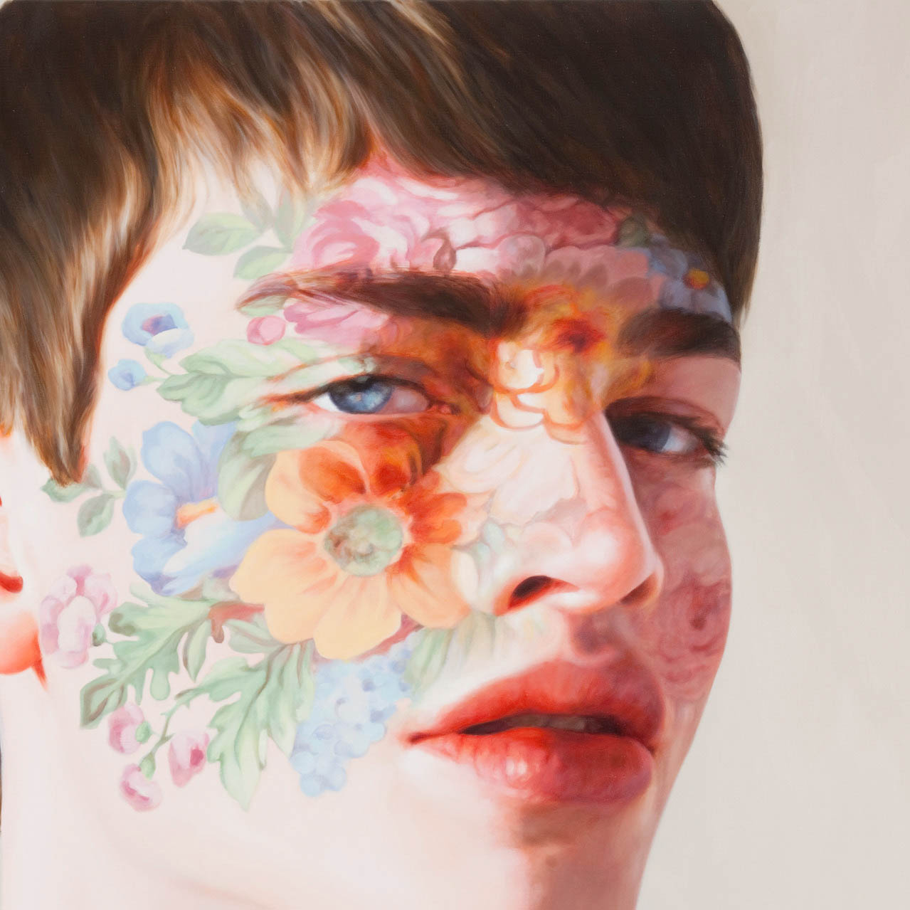
Posts Tagged ‘interior design’

3D rendering by Cristina

The other week Cristina asked me if she could include some of my artwork in her interior design 3D Studio Max class work and she has posted the result on her blog today. Such fantastic renders! I used to work for an architectural firm and found 3D rendering intriguing. I loved seeing how she incorporated my work into the styling of the room.

See the rest of her renders at her blog.

Friday Fance: House of Fance

The Water Works

I’ve been watching a lot of Grand Designs lately, and one episode in particular caught my imagination. A couple bought a disused water works building and pretty much converted the entire building themselves into a home with a huge living area, while maintaining the integrity of the materials used in the original building. You can see from the screen cap how they’ve fitted out their home: using very sleek modern furniture; a limited palette of red, black and white; and even a Mini converted to a desk! I’m not so much a fan of the modern fittings myself but I am totally gaga for the huge space and the exposed brickwork. If I had this amazing building I’d probably create an indoor garden, use wild furniture in natural materials and incorporate a lot of texture through soft furnishings, fittings and art. I’d literally go “wild and woolly”!

If Kevin McCloud were to appear as my wish-granting genie, I would include the following in my House of Fance:

chintz of darkness
⇒ Tents remind me of childhood – we’d drape afghan blankets over chairs and create a soft and cozy place to play card games or dolls. I love the idea of creating a childlike space for my home… who wants to be an adult? (Image via Chintz of Darkness)

Dahlias from A Creative Mint
⇒ I’d have flowers EVERYWHERE. Pinned into the curtains, tucked into jam jars and garlands draping from every ceiling beam. Sure it’d be a pain to maintain, but this is my fantasy house! (Image from A Creative Mint)

Chintz of Darkness
⇒ Of course I’d grow all the flowers in my garden, installed in a dilapidated wing of my House of Fance. (Image via Chintz of Darkness)

decor8
⇒ I love all of this: the black wallpaper, all the colours, even the papered ceiling! I think I would incorporate pops of cyan and magenta into my dream house. (Image via decor8)

dottieangel
⇒ Pretty crockery and doilies, that’s so me. (Image via dottie angel)

Michel Haillard V
Michel Haillard’s furniture is the kind of fanciful monstrosity I’d like to include to offset the delicate femininity of garlands and doilies and tents. It’s so primal and earthy, I’d feel like a queen!

So are you a thoroughly modern man or a fiend for vintage? How would you decorate your House of Fance?

Friday Fance: Late Edition

I wasn’t sure I’d get the Fance up today because I had a bunch of stuff to do, coupled with some stuff I forgot I had to do. I’m not one of those organised bloggers who has posts queued up for weeks… noooooo. This is genuine off-the-cuff blogging magic, right here. I took my carrot cupcakes out of the oven, flopped into my seat and thought about all the fancy things I’d seen this week and thus… cobbled together this barely passable collection of whimsies!

loveMaegan collar
⇒ I have always loved these collars! Love Maegan has put up a tutorial on how to create this ruffly collar, which can be wrapped and pinned different ways. If I can find any lightweight cotton fabrics I’m totally making this for summer.

Henrik Simonsen Midnight Garden
⇒ Henrik Simonsen’s Midnight Garden is so gorgeous. It reminds me of a cyanotype, or sunprint. I’ve been googling them madly for the last week… I desperately want to buy a bunch of the special paper and have a sunprint party in a park with my friends.

Matt Preston
⇒ The First Man of Fance, Matt Preston, has such a way with words! *swoon*

gene coffey
⇒ I am so in love with this tattoo! How could I not be?

Chandelier from Chateau de Versailles
⇒ When I am rich and fancier I’m going to have a chandelier, a painted fresco (one? why not 10?!) and moulded ceilings. Go check out the photos from the Chateau de Versailles on NOTCOT… dreamy!

La Catrina - Laurie Lipton
Laurie Lipton’s pencil pieces are bad ass fance.

Amelie’s Petite Maison – Our petite honeymoon

I want to share some photos I took of the amazing cottage we stayed at last week. It’s located in Montville, Queensland which is a two hourish drive north of Brisbane. It is part of a bed & breakfast adorably named The Spotted Chook and is fully self contained, overlooking a lush cluster of hills and trees – the best part is that you can sit in the spa on the balcony and appreciate the serenity! The cottage was decorated in a beautiful French country rustic style and was just the most fabulous place I have ever laid my head.

The entrance is soooo cute! Read Full Post

Inspired by: Flowers

I have promised to do a tutorial on flourishes, but my RSI is quite chronic at the moment so I’m reducing the amount of fine pointing activity I do – unfortunately this includes flourish work in Illustrator! I do have some free vector shapes lined up (peacocks!), but I’m quite snowed under at work right now and tend not to want to sit on my computer at all when I get home!

Right now – it’s my lunch break, and I’m sneaking in a quick blog entry just to let you know I’m still alive and thinking about you.

As I approach the upcoming flourish tutorial, I’ve been thinking a lot about individual style, and what I’m inspired by. A lot of my flourishes are derived from the lines and forms I see in gardens – albeit highly stylised. I’m also an avid fan of lurid patterns in textiles and anything tactile in general. I try to bring as much of this aesthetic into my own design work as possible, so I keep an eye on lots of interior design, craft and graphic design blogs.

The other night I came across a mother lode of gorgeous vintage floral and paisley fabric images on ebay, so I’ve transloaded many of the images to my flickr account. I’ll post my favourites here, along with a selection of other flora inspired items that really inspire me.
Read Full Post

White Lighting Trend

All I’m hearing is that black and white are “it” for decor. It’s a little too stark for my own personal tastes, but I’ve noticed a quirky little lighting trend harking all the way back to the 50s and 60s coming into vogue again. It makes sense, seeing that mid century furniture is all the rage (and dear as SIN!), but the stark white plastic almost demands blacks and greys to compliment – it shall have none of that fussy colour business thank you very much!


Left – Artichoke pendant light shade from Louis Poulson.
Right – Norm 69 light shade by Simon Karkov.

I think I like the modern interpretations of the white pendant light shade much better – for starters they’re much more reminiscent of floral shapes, albeit highly stylised. They’re also much more accessible. The Artichoke pendant lighting is around $4,000, but you can buy a Knappa pendant light shade for around $40! It’s much softer and made from plastic too.

Even better, is Tord Boontje’s light treatment – made from single sheets of cut paper that have that real handmade aesthetic. I’m in love, and I want one right now! These are even more floral, but still white so you can have your whole white trend as well as your cake (and eat it too!)

So, there are a few ways to soften the starkness of a white decor – but if you’re like me you’ll probably end up throwing a few cans of highly saturated colour at the walls just to feel comfortable!